
PowerPoint presentations are incredibly useful for all consultants to convey their data and information. Well-crafted slides can make a huge difference between an average meeting and one that leaves a lasting impression. However, navigating PowerPoint's features can be overwhelmingly accompanied by tedious and manual processes.
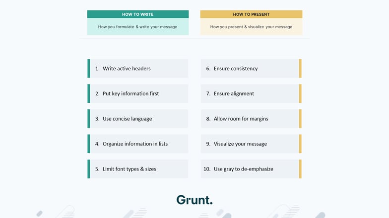
Based on our experience as former consultants and creating thousands of slides throughout our career, we've compiled an essential list of our top twelve tips and tricks to help you make outstanding slides. The first five tips focus on how you write your message, while the second part on presenting and visualizing your message. We'll review each of them and show some examples to make them easier to understand and apply in your practice.
1. Write Active headers
Challenge:
The header is the most important part of any slide because it gets read first. And for some readers, it might be the only part of the slide they read if they're browsing through the presentation. With generic and passive headers, you risk losing your audience's attention before they've heard the story.
Tip:
Instead, use the header as one of the main tools to tell your story by writing active headers. It enables you to focus on the purpose behind each slide and gives viewers an insight into what they can take away from them. Getting this right will ensure your audience absorbs all the critical information from the slides so they can easily follow up on any questions or further discussions.

2. Put key information first
One of the fastest ways to ensure your audience is quickly informed is to prioritize critical information throughout your slides. This will help keep their attention and better capture essential data points.
Challenge:
In the slide example below, you will find a clear and concise message. But, it misses the most crucial part, which can also depend on the context. It means we would argue that the primary information is growing demand, and sales are up more than 5%. If your reader only sees one of these lines, it should be followed by the second line as an argument supporting the main headline.
Tip:
Putting the key information first makes the primary information clear and more likely to be absorbed by the reader. This principle applies to both within a sentence on a slide and in the presentation as a whole. And it's also a reason why you often see presentations start with the executive summary.

3. Use concise language
Challenge:
Sometimes, we include ambiguous words in sentences we write that could be expressed with fewer and more direct words. Writing for a business slide is very different from writing in other contexts.
Tip:
The focus is to make a sentence or a paragraph more concise, and several techniques exist to achieve that. One of them is to replace several weak words with stronger words. In the first example, we've cut the sentence from thirteen to six words by replacing weaker words with a single stronger one. As you will notice, just a minor tweak has produced an impressive result.

Bonus Challenge:
In the second example, the sentence is unnecessarily wordy and includes many words that don't add value. In this way, crucial information can get lost, and your audience might not understand what you are trying to explain.
Tip:
We've cut the sentence from seventeen to six words by omitting unnecessary words without losing any information. Notice that none of the words are changed or replaced. We've just removed those that didn't add any value. To ensure that your presentations are effective and impactful, use language that is clear and to the point. Doing so will help you make a strong impression on audiences of any size.

4. Organize information in lists
Challenge:
Writing good text paragraphs is key, but too many blocks of text can make your presentation tedious and difficult to read. Finding the right balance between informative paragraphs and making your text visually appealing is essential.
Tip:
To make the slide more readable, you need to distill the paragraph into a bullet list. It makes it easier to see and absorb and helps you be more concise in your language since bullet points are usually shorter than paragraphs of text.
Bonus Tip:
Be careful! Some users may get carried away with this tip, allowing only bullet points without writing any paragraphs. Don't forget that paragraphs can add greater depth to your message – ensuring everyone can properly understand it! So, always pay attention to doing this when appropriate for the content.

5. Limit font types and sizes
Challenge:
Using different subtypes and sizes is a sure way to increase the clutter on your slide quickly. In our example below, the chart title and the subheader have two different sizes, and there are also two levels of bullet points with different font sizes.
Tip:
Limiting the number of font types and sizes greatly improves readability. As a rule of thumb, we recommend not exceeding one font type and three font sizes on a slide. The best practice is to have the header, subheader, and general text. However, there are many exceptions to this rule or this guideline, but at least you should be very conscious about how many font sizes you use and try to limit them.

6. Create a Storytelling Flow
Challenge:
Sometimes, the content can appear disconnected while navigating through a presentation. It is a challenge faced by many presenters, and the audience struggles to see the bigger picture of what you're trying to explain.
Tip:
Imagine your presentation as a captivating story, each slide a new chapter that seamlessly connects to the next. The key lies in maintaining a clear and logical structure. As you organize your content, ensure that every slide flows naturally into the next, forming a coherent journey for your audience.

7. Ensure Consistency
Challenge:
In the first sample image, you will notice three different ways of writing subheaders and no coherent use of color. There are also three different ways of looking at the forecast number: option one used a hatch style; in option two, there's a lighter color of the main color; and in option three, there's a dotted line in the line chart.
Tip:
Try using the same terms, styles, and colors throughout your presentation to improve this. Choose the same chart for similar data and the same way to display forecast numbers and other different things you want to visualize in the presentation. Also, stick to one type or one style of subheaders, and don't change the terminology unless you need to. This makes it confusing for the reader, so stick to one of the already mentioned.

8. Ensure Alignment
Challenge:
As you will notice on the next slide sample, many elements distract the reader from the message. We can easily say that it is unprofessional, and more importantly, the message is less believable. Since the presentation looks sloppy, it doesn't look like much work has been put into it. And you don't want that to create that kind of impression, right?
Tip:
Aligning everything to a grid and each other is key to creating a professional presentation. Presentations should be thoroughly aligned to inspire confidence and ensure the successful delivery of key information.

Bonus Challenge:
Working with PowerPoint can be challenging, particularly when creating consistent alignment. Since manual adjustments are required, you would typically try to adjust one side according to another side's objects. Getting it right might be difficult and time-consuming.
Tip:
Grunt can greatly help you in a situation like this. You just need to make sure to download our FREE Workflow Tools and make sure that the smart selection is turned on. With one click, it aligns them perfectly. If you want to adjust the spacing, you can do so without messing up the alignment and keeping an even distance between the objects.

9. Allow room for margins
Challenge:
This is one of the practices we saw being violated most often. With margins, anyone can get carried away when writing a paragraph, and it suddenly doesn't fit with the allotted space on the slide. But this shouldn’t be a big problem, right? You can increase the textbook size slightly by dragging it down to the right. That, unfortunately, eats up your margin and breaks the consistency across slides. This is one of the principles we want to add here, as the margins are the breeding space of your slide, so removing them makes it even worse.
Tip:
We recommend sticking to chosen margins across the presentation and finding other ways to make the content fit. For instance, you can use techniques described earlier, like shortening the text. You can also reduce the text size or split some of the content into a separate slide.

10. Visualize your message
Challenge:
Every presentation quickly becomes tedious and difficult to read, so usually, you want to look for ways to visualize what you're presenting. The most common way to visualize, especially in business presentations, is through charts. But many other types of content can be visualized as well.
Tip:
To do that, we recommend putting chevrons. It communicates a sequential nature and makes time flow from left to right. It also lets one style the last step differently since it's unlike all others.

Bonus Challenge:
We've done some work analyzing and comparing some products with specific features on the second sample. The analysis is good, and we've done some classification, but it's difficult to see the result at first glance. So, how to make this better?
Tip:
Adding some Harvey balls, checkmarks, or maybe a star gauge would be one of the proper ways to do it.

This is also where Grunt can help get great results fast. When you use Grunt, you can choose different visualizations like Harvey Balls, check marks, and gauges, and with a couple of clicks, the data looks much better and easier to read. Grunt automatically adds some other things to create a great slide. The sizing can be automatically adjusted to align with each other.
Also, each row and column are already perfectly aligned, and the same color is used to make it consistent. It's easy to resize, reposition, or rearrange everything while keeping these objects aligned, perfectly sized, and looking great.

11. Use gray to de-emphasize
Challenge:
Colors should always be used with a purpose. The main message in our example is that CorpX has outperformed all its competitors. So, how do we use colors more purposely to convey this message?
Tip:
De-emphasizing the competitors makes it easier to see our focus company, which we mentioned in our example CorpX. And using grey tones is a great way to do that. Always make sure that what you're deemphasizing fits with your message.

Bonus Challenge:
The purpose of using colors doesn't apply just to charts but to all other elements. In the last example, you will see that the illustrations' colors and logic partly give the reader some conflicting information. The arrows indicate that the main consequence is the most important, but the heavy dark color draws the eyes towards the first object.
Tip:
Shifting the use of colors to match the illustration will improve the readability. Again, using gray tones is the right way of doing it, and using it here to contrast a few purposely chosen colors makes the slide much easier to read.

12. Use high-quality images
Challenge:
Low-quality images can appear pixelated and unprofessional, undermining the content's overall visual impact and credibility.
Tip:
Use high-resolution images to enhance your presentation's professional appearance and visual impact to engage your audience

Conclusion
Now that you know some secret tips of consultants for creating an effective presentation, it's time to implement them in your work. Utilize these tips in your next project and easily produce presentations that will do both inform and engage your viewers. Doing so will give you an edge over the competition and significantly speed up your workflow.
If you want to learn more about creating great presentations with Grunt, sign up for our Public Demo. It's packed with even more information and examples to help you get started.
Download our tips and best practices for PowerPoint here.


