
As visually oriented beings, humans tend to understand relationships in data much better if they've been properly visualized. Charting, when done right, is a highly effective tool for doing data visualization, and it's something we care a lot about here at Grunt. This blog post will walk you through some of the basics of choosing the right chart type and the questions you should ask yourself before selecting one. By the end, you should be able to choose the perfect chart for your dataset. Let's get started!
Make your data goals a reality
In an excellent book on data visualization, Edward Tufte wrote: "Clutter and confusion are failures of design, not attributes of information." In other words, conveying the key information in your data really is mostly about making the right design decisions. Choosing the right chart type is a big part of that.
Below is a classification framework that we find useful when narrowing down which chart types are appropriate in a given context. It asks you to consider the relationships you want to visualize in your data. That will help you move on to the appropriate chart type.
Here are some questions you should ask yourself:
- How many variables do you want to show?
- Would you like to display some values over a time period?
- Are you interested in the correlation between different variables?
Asking these questions will bring you closer to classifying your particular case. Once you have an idea of that, you can start thinking about the best way to present it.
Charting your business success
There are four groups of charts that all highlight different properties in your data. But how do you know when to use a column versus a bar chart, or when (if ever) you should use a pie chart?
We've broken down each of them to help you identify which chart might be suitable for your use case to communicate with them effectively.
Comparison charts
You'll want a chart from the comparison category if you need to compare one or more datasets. These visual representations can compare items and show differences over time. The category includes column charts, bar charts, and line charts.
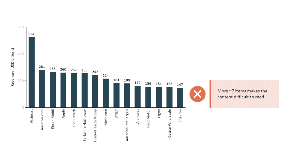
Column chart
When the number of items you want to compare is around 5-7 or fewer, column charts are a good choice. You might be tempted to use a column chart for all kinds of data, but when the number of your items or categories increases it becomes much trickier to read the labels. In that case, you should probably choose something else.
Bar chart
As we mentioned in the section above about column charts, if you want to compare multiple categories; items; names of companies etc. bar charts can be a good choice.
There are many variations of them like clustered bar charts - to show multiple series of data, horizontal and vertical bar charts, deviation bar charts – to show positive and negative values such as profit and loss, stacked bar charts, etc.
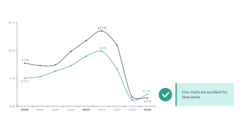
Line chart
Line charts are similar to column charts, where you can compare data that changes over time. The main difference is that you can display many more data points efficiently. You must be careful though, as too much data can confuse your audience. Simplicity and not too many series are critical in a line chart.
Composition charts
You'll use the charts from the composition category to display parts of a whole that change over time. This category includes charts like pie charts, waterfall charts, and stacked column charts.
Pie charts
Pies come in different shapes and sizes. However, because they are so visually appealing, they are often misused. Generally, they are suitable for simple, static compositions with only a few items.
What might surprise you is that many experienced finance professionals and consultants rarely use pie charts. Some even ban them, one of the reasons being that change in composition over time is difficult to show in pies.

Our example shows a quarterly report of the business that tries to show changes in the share of net sales from 2019 to 2020. But it isn't easy to read what's changed from the two pie charts, right? A better choice would be a 100% stacked chart. See how much easier it is to understand the size differences in the 100% stacked chart versus the pie chart above?

Pie charts also struggle with many similarly sized items. In the example below, you can see the data for six different companies. You will face the same struggle as in the previous example; it's hard to read and understand the data in the chart without the label.
Can you tell the difference between companies Alpha and Beta? Probably not easily, and even if you could tell that Alpha is bigger, it's nearly impossible to see by how much.

Waterfall chart
Waterfall charts are great when used in an appropriate setting, but they are quite ineffective when presenting changes over time. in the example below, it's difficult to tell which month had the best performance and how the split between Products A and B has changed over time.

Waterfalls are great for bridging one point in time to another and for understanding how an initial value is affected by some series of positive and negative values.
A great thing about a waterfall chart is that positive and negative values can be colored in a way that makes it easy to spot the positive and negative values right away. A classic example we would give is the Cash Flow Bridge.

Stacked Column chart
A stacked column chart is a great way to compare proportions or percentages within different categories. For example, you could use a stacked column chart to show different age groups that make up a city's population or to compare the market share of different companies in an industry.
A stacked column chart also better shows changes that happen over time and the comparison versus, for example, combined charts.
If the chart doesn't give you much insight without the labels, it doesn't add much to the reader.
Relationship charts
You'll use a chart from the relationships category to present how two things are related to each other or the correlation between two or more variables. In this category, you'll find charts like bubble charts and scatter plots.
Distribution charts
And finally, if you want to show how variables are distributed over time, you'll use a chart from the distribution category. Distribution charts help identify outliers or trends and include charts like histograms and scatter plots.
Distribution charts, for instance, are not that common in the business world. And relationship charts are helpful only for the more complex use cases.
The most used ones are bar, column, and line charts from the comparison category and stacked column and waterfall charts from the composition category. Using these types, you'll get very far in the business world.
You might think that looking at these examples, there are many classics - all the same old, boring chart types. But having something old doesn't always mean a bad thing.
On the contrary, there are reasons why these types of charts were chosen in the first place - they work well due to their simplicity, and it makes it easier for you to communicate what you want to present. So we would argue sticking to the safe choices.
Now that you know what chart category you're looking for, it's time to move on to the next steps.
Chart design pitfalls: how do you avoid common mistakes?
Highlight what matters
When you decide to put up your numbers in a chart, you have already implicitly decided that they are important together. If not, you could have just put one of the latest numbers in a big font in the center of your slide, but there are better ways to do things.
Let's look at an example of recollection of defects per thousand, for instance, for a plant.

The only thing you can see are some of the numbers in the chart. And what should you do to highlight the biggest number? A common misconception is that you focus only on the latest number. We strongly suggest you don't do that.
And in this case, even though the latest numbers are the highest, there is a clear trend here that you're not focusing on.
So a better way to highlight this chart would be to focus on the trend. In this case, adding a value growth arrow would be an excellent way to do it. It is also called a CAGR.
You'll also notice that the number of defects has increased by 20% YoY since the start of this time series, which is quite a lot. And that is the insight you don't want to hide away.

In another example, it's pretty obvious when you look at the data that from 2013 to 2020, things have been relatively stable, and then there was a steep incline or increase from 2020 to 2021.

So in this case, it would be best to focus on the latest gap, and you can do that with a value jump. If you draw your conclusions from the last example and add a growth arrow to this chart, you're trying to create a trend when no trend exists. That's something we wouldn't recommend at all.

Eliminate all redundant data
Are you one of those who adds a legend to all charts every time? To make your life easier, we advise you to exclude a legend when you only have one series or category. All the details that take your audience's attention and are not necessary for your data presentation should be removed.

Moving the labeling into the chart
In this example, the legend is serving its purpose, so without the legend, we wouldn't know which line represents which data. However, are there still things we could do to simplify it? Are there better ways to add the name to the lines?

If possible, we recommend moving the labeling into the chart because it makes it much easier to read. Then your audience doesn't have to switch between reading the actual chart and reading the legend as it's embedded in the chart.

Time-based content styling
When styling time-based content, the pitfall is that you tend to style everything the same way. And when we say time-based content, we mean that you have actual values, budget values, and forecasts that you want to combine in the same chart.
And this is, to be honest, quite hard.
What you shouldn't do is highlight the current value with the shape. Unfortunately, we see this often, which can get ugly and confusing for the readers.

What we recommend is that you divide this into three different groups. First, you have the actuals that your style with a solid fill color.
Then you have budgets that you style with a solid outline, and then you have forecasts where you use a hatch brush everything in the same color, so it resonates. It looks aesthetically pleasing, but it's really easy to spot the differences.
Bonus tip:
Highlight the current value on the cash core axis with a different label and add a B for budget and E or F for the forecast to your forecast values. It just adds that tiny hint of information in addition to the patents.
Overusing combined chart
Combined charts are hard to read for most people, so they are dense. They pack lots of information that could be too much for your readers. You should be careful when using combined charts; they must correlate if you put two different series.
Otherwise, it's better to, for instance, separate it if you have some profits or some revenue, and MBTA should show below or above the chart.
If in doubt, stick to the classics
Undoubtedly, finding your way in the chart jungle can be challenging. And as we already mentioned, with the right chart type, you'll be able to communicate your data visualization clearly and effectively.
Safe choices make it easier for you and your reader. So, to create an eye-catching business chart, start with a composition or comparison chart.
With our simple tips and practice, you can create charts that are both easy to understand and visually appealing.
And if you want to take the guesswork out of it, consider using our PowerPoint add-in that automates all the processes for you.
For more input on creating perfect business charts - see our FREE webinar!
Good luck!


